I remember when I first wanted to learn UI design. I had ideas for apps and would tinker in Xcode until I had a working MVP. But it looked like crap. So I started looking online to see how design was done.
After landing on sites like Dribbble and Behance, I was convinced that what I was looking at was the crème de la crème of design. Everything looked so polished and beautiful. That is until I started copying those designs for those toy apps I created in Xcode. I quickly realized there were things that didn't make sense. Swipe to confirm put in weird places, spacing that was off, large amounts of whitespace everywhere, and all the types of -morphism (glassmorphism, claymorphism, neumorphism) that would make me dizzy after repeated use of the app.
That's where UX came in. I began slowly learning about visual hierarchy, spacing and alignment, usability, and accessibility. During this time I started working in Figma and did some courses on some advanced features as well.
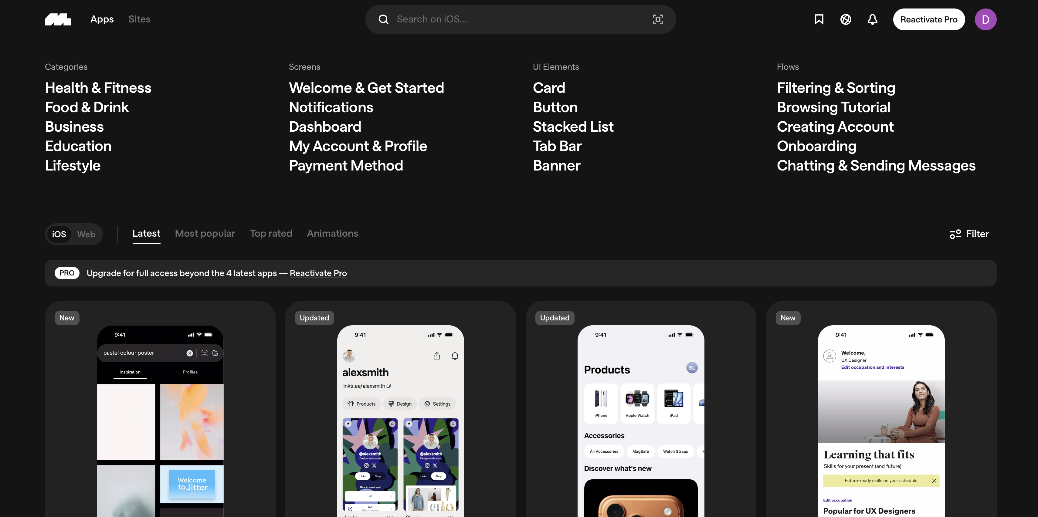
I also landed on a site called Mobbin. Mobbin collects screenshots of popular iOS apps into one place for a hefty price of like $100+ per year. But the convenience of not having to take my own screenshots was enough for me to go for it. I could now reference designs that looked great but also had great UX and had millions of users behind them.
The Dilemma
So at this point I had all the tools I could ask for: Figma, Mobbin, and the 5+ courses I had done at this point ranging from Interface Design to UX that I could reference back to.
But now what? How was I supposed to get better at design to the point of coming up with my own original designs?
Well, it turns out most designs aren't original. That's not to say everyone's copying or straight-up ripping off other designers, but I learned about a rule that even seasoned designers resort back to when starting their own designs.
The Rule of 3
- Typography
- Color
- Layout
You can only choose 1. That's the rule.
So how this works is when you're looking for design inspiration and you see a design for a mobile app that you really like, you can only take one of the three above — and when I say take I mean like take 100%. Maybe the thing that really catches your eye is the color, so you can take that exact color palette. But if you also use the same typography or the same layout, then it would be considered stealing.
This rule was great for me because I could still get a sense of guidance when crafting my own designs, but at the same time I still had to exercise my design muscles and remember what I learned about in the courses I had done.
And so... I ended up coming up with my own daily practice.
My Flow
Week 1-2
- Go to Mobbin and grab a screen I liked
- Bring it into Figma and do a 1-1 copy
Weeks 3+
- Go to Mobbin and grab a screen I liked
- Bring it into Figma and do a 1-1 copy
- Do a "Remix" where I use the "Rule of 3" and keep the one thing I like most, but change the other 2
Observing the Patterns
The first part of my flow was to copy the designs from Mobbin 100%. This was to learn about how to design with not only good UI but also good UX.
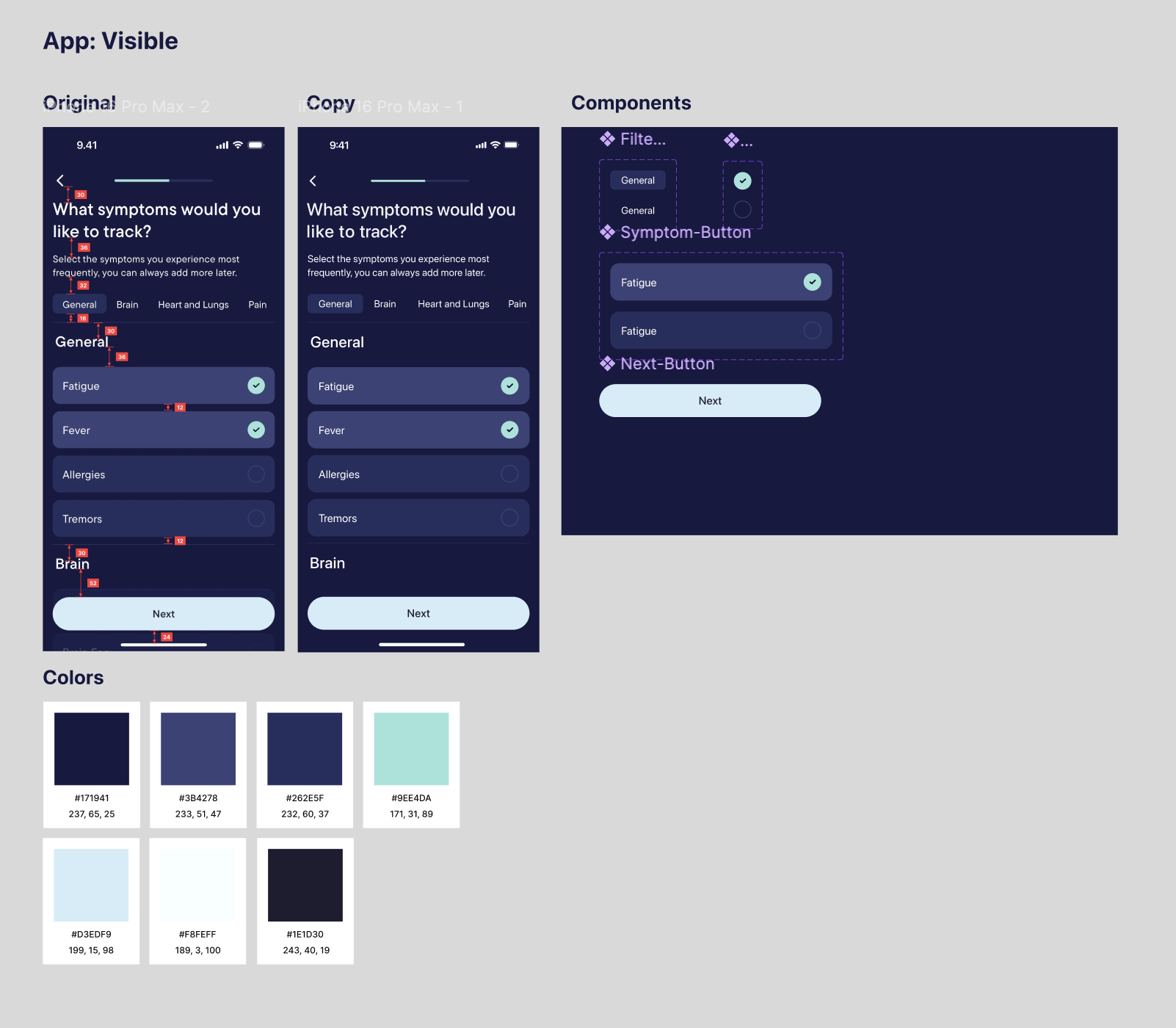
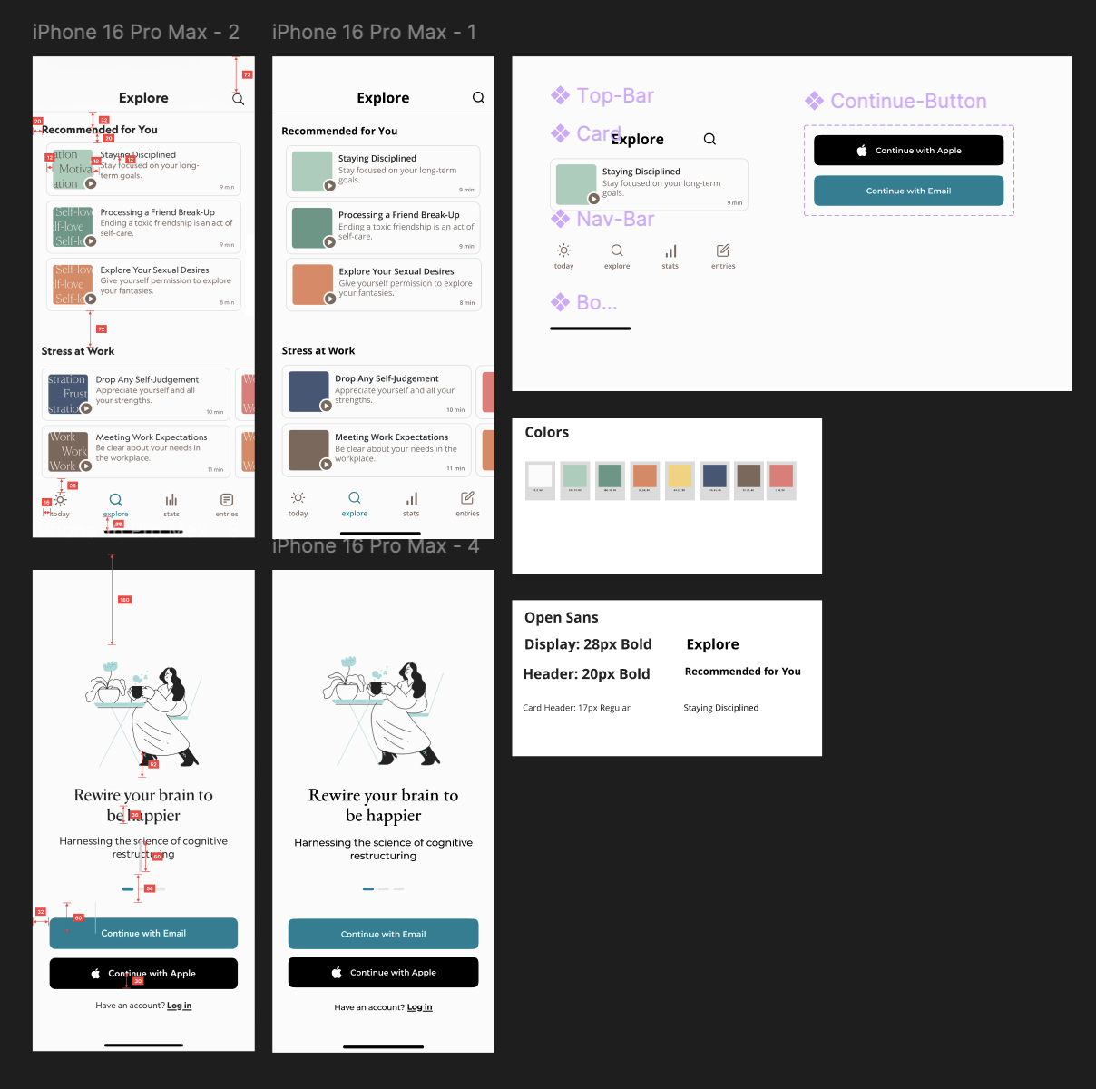
It only took me 4 days to start seeing the patterns:
- Side gutters were no more than 24px and no less than 16px
- An implicit grid system was used with 4px or 8px
- 72px spacing was commonly used between the top of the screen and the beginning of content
- No more than 2 fonts per screen
- Examining colors with HSB shows that saturation and brightness are usually in the same range, with only Hue changing from color to color
A Case for Polinu
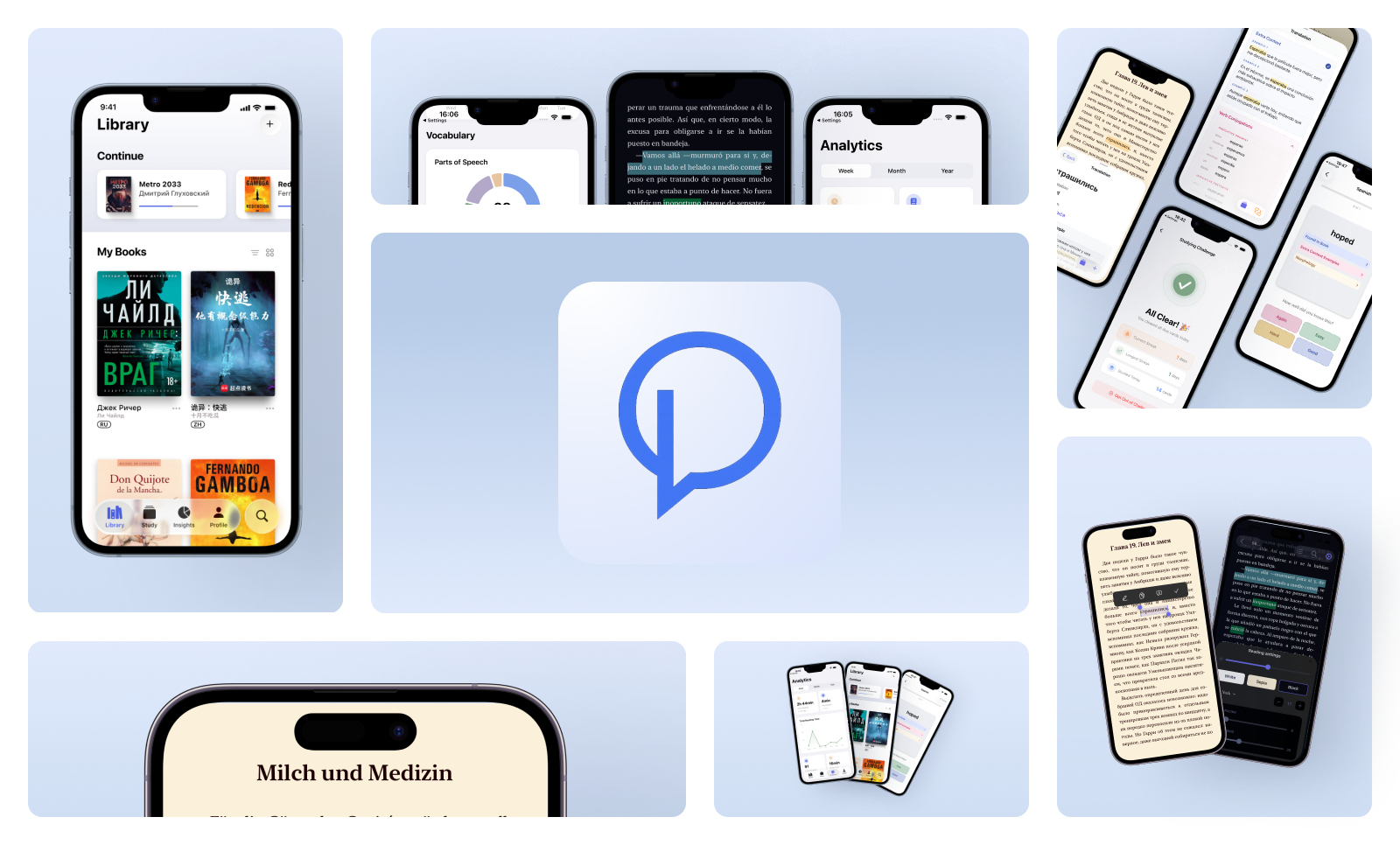
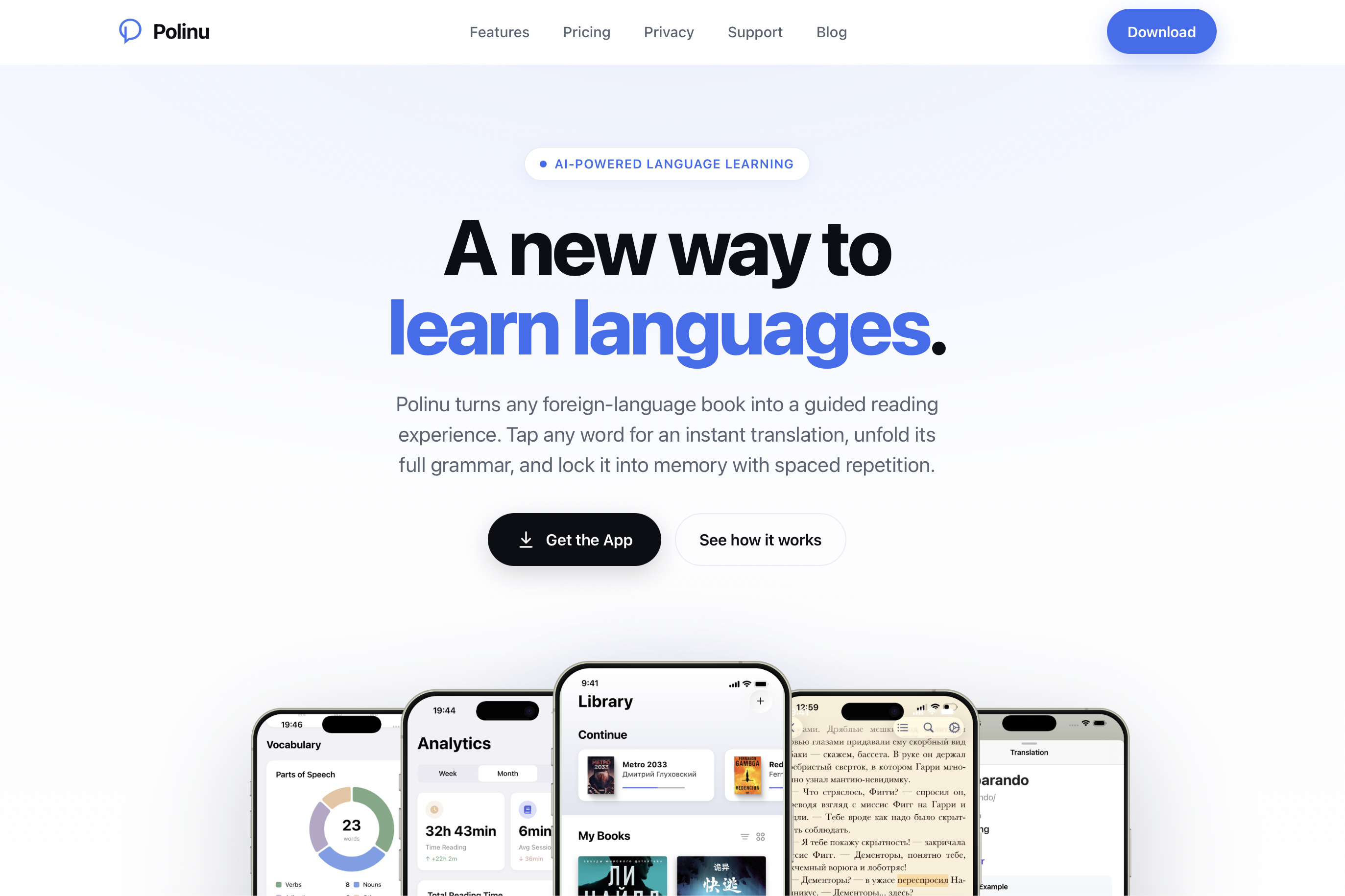
Polinu is my first production iOS app, currently in the App Store. It's an AI-powered iOS language learning app that lets users read foreign language books with built-in translation, morphology analysis, detailed analytics, streaks, and spaced repetition flashcards.
It's not only my baby, but it's my design EP — a true case study that has blossomed into the wild.
And it's definitely not perfect.
Everything that I had learned about design and practiced daily was put to the test.
Why?
Because my daily flow involved apps that usually could be put into a single category: Crypto, Meditation, Finance, Health, Food, Transportation, Shopping.
Polinu? Polinu is a hybrid of a reading app, a language learning app, and a flashcard app.
So how does that work with the design?
Some questions I kept returning to were:
- Well, if it's a reading app, the design should be focused, modern, but conservative
- Well, if there's language learning, then the design should be engaging and fun
- But if it's a flashcard app, then it should be modern but not too distracting and keep it minimal
Maybe I'm an over-thinker, but those are the mental gymnastics I had to do to come to a decision. And the truth is... I don't think that decision has ever been made.
A year from now I could decide that Polinu should have its own mascot like the Duolingo owl.
Yea, maybe I'll have a cute little fox. Or a baby elephant.
Or maybe it will become even more conservative like Apple Books.
The Challenge and Final Remarks
If you're a dev reading this and have struggled with design, I highly recommend trying out my daily flow for even just a week. Chances are your problem-solving mind will quickly see the patterns just as I did, and soon you'll have your own designs you could use with your apps.